 CAD
 USD

 We Ship across CANADA & USA.

Trade shows are highly competitive environments where brands have only a brief window to capture attention. In crowded exhibition halls, attendees are exposed to hundreds of visual messages within minutes, forcing them to make quick decisions about which booths are worth their time. In this context, trade show booth signage plays a decisive role in visibility, engagement, and overall event performance.
Booth signage acts as the primary visual identifier of a brand. It communicates who you are, what you offer, and whether your solution is relevant to the attendee, often before any personal interaction occurs. Poorly designed or unclear signage blends into the background, while focused and well-executed signage helps a booth stand out and attract qualified visitors.
According to research from the Center for Exhibition Industry Research (CEIR), visual elements such as signage, graphics, and booth layout strongly influence attendee behavior, including the decision to stop or walk past a booth. These judgments are made quickly, highlighting the importance of concise messaging and strong visual hierarchy.
Effective trade show booth signage does more than display a logo. It establishes brand credibility, reinforces positioning, and sets expectations for the experience inside the booth. When aligned with clear objectives such as lead generation, product education, or brand awareness, signage becomes a strategic asset rather than a decorative element.
Signage is also one of the most cost-effective tools for improving return on investment. Considering the significant costs of exhibiting, including booth space, logistics, staffing, and travel, a booth that consistently attracts the right audience outperforms those that rely only on foot traffic or outbound engagement.
This guide explores practical trade show booth sign ideas and proven strategies to help exhibitors design signage that attracts attention, communicates value clearly, and supports measurable trade show success.
Understanding the Role of Trade Show Booth Signage
Trade show booth signage serves a functional purpose beyond branding. It works as a visual communication system that guides attention and shapes attendee perception. Strategic signage influences movement across the exhibition floor and delivers key messages continuously without relying on staff interaction.
At its core, booth signage fulfills three primary roles: identification, attraction, and qualification. Identification helps attendees quickly recognize the exhibitor and their category. Attraction captures attention in crowded environments, while qualification allows visitors to decide if the booth is relevant before engaging further.
Primary Functions of Trade Show Booth Signage
- Brand Identification
Clear logos, consistent brand colors, and uniform typography establish credibility and make the brand easy to recognize.
- Message Communication
Concise headlines and short value statements clearly explain what the company does and why it matters.
- Visitor Direction
Directional and informational signs help guide visitor movement within the booth and improve traffic flow.
According to research published by the Center for Exhibition Industry Research (CEIR), visual cues such as signage and graphics strongly influence whether an attendee chooses to stop at a booth. This confirms that signage is often the first point of engagement, not a secondary support element.
How Attendees Process Booth Signage

Trade show attendees do not read signage the same way they read websites or brochures. Instead, they follow a rapid visual scanning process:
- Notice: Does anything visually stand out from a distance?
- Interpret: Can the core message be understood instantly?
- Decide: Is this relevant enough to justify stopping?
If signage fails at any one of these stages, engagement drops sharply. This is why long descriptions, excessive text, and low-contrast designs often underperform in live event environments.
Strategic vs Decorative Signage
Not all booth signage serves the same purpose. High-performing exhibitors clearly separate decorative signage from strategic signage.
- Decorative signage focuses on appearance but lacks clarity or intent.
- Strategic signage is designed to support specific goals such as lead generation, product demos, or education.
A study summarized by Exhibitor Media Group shows that exhibitors who align booth visuals with clear objectives achieve stronger visitor engagement and better post-event recall. This confirms that signage effectiveness depends on intent, not visual appeal alone.
Why Signage Influences Perceived Brand Credibility
In exhibition environments, attendees often associate booth quality with brand reliability. Professional vendor booth signage signals preparedness, scale, and trust. Poorly printed or unclear signs can create doubt, even when the underlying product is strong.
Because signage is visible from multiple angles and distances, effective signs for vendor booths reinforce brand perception throughout the event. This repeated exposure improves brand recall and increases the likelihood of post-event follow-up, which is a primary goal for most exhibitors.
Common Trade Show Booth Signage Mistakes Exhibitors Make
Trade show booth signage usually fails not due to poor intent, but because exhibitors underestimate how signage performs in live environments compared to digital or print marketing. The mistakes below are among the most damaging when it comes to visibility, message clarity, and visitor engagement.
Mistake 1: Designing Booth Signs for Reading Instead of Scanning
Core issue: Excessive text density
Many exhibitors overload signage with product descriptions and marketing language meant for close reading. In reality, attendees are moving quickly and processing information visually. Signage that requires focused reading is often ignored.
Research from the Nielsen Norman Group shows that in high-stimulus environments, people rely on rapid visual scanning and headline recognition rather than paragraph-level reading.
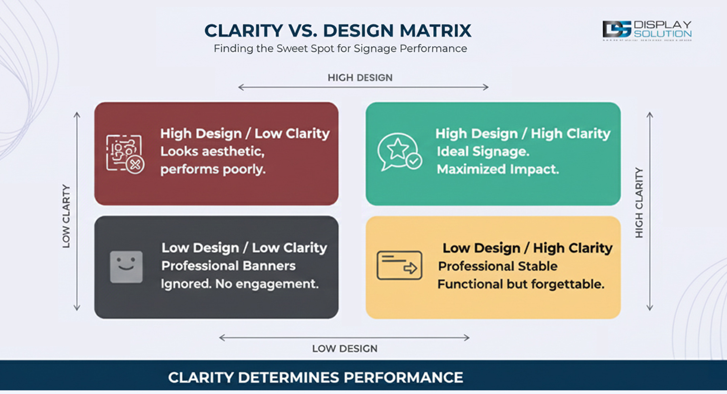
Mistake 2: Prioritizing Aesthetics Over Message Clarity
Core issue: Style without substance
Visually attractive signage can still fail if it does not clearly explain what the exhibitor offers. Abstract visuals, decorative fonts, and vague taglines may look impressive but often leave attendees unsure of relevance. This is a common issue with poorly planned trade show booth signs.
Insights shared by Exhibitor Media Group show that booths with unclear messaging receive lower qualified engagement, even when visual quality is high. This reinforces the importance of clear, purpose-driven exhibitor signs.
Mistake 3: Using One Message for All Audiences
Core issue: No visitor segmentation
Many booths rely on one broad message meant to appeal to everyone. This approach fails to connect with specific buyer personas and often leads to unqualified traffic or visitor disengagement.
Event marketing analysis published by Event Marketer shows that role-specific and personalized messaging improves engagement and lead quality at live events.
Mistake 4: Treating Signage as a One-Time Asset
Core issue: Poor reusability planning
Signage is often created for a single event without considering future use. This leads to higher long-term costs and inconsistent branding across events. Planning vendor booth signage for reuse helps maintain visual consistency and reduces repeat production expenses.
The International Association of Exhibitions and Events notes that modular and reusable booth components improve cost efficiency and support consistent branding across multi-event calendars.
Mistake 5: Failing to Align Signage With Booth Objectives
Core issue: No performance intent
Signage is often designed without a clear goal, such as lead capture, demos, or brand exposure. Without intent, signage becomes passive instead of a strategic driver.
A report cited by Bizzabo shows that exhibitors who align visual assets with measurable objectives achieve stronger post-event results.
Types of Trade Show Booth Signs (Focused on High-Visibility)
In medium and large trade show environments, hanging signage plays a key role in booth visibility. Suspended above booth structures, these signs are often the first brand element attendees notice from across the aisle.
The effectiveness of hanging signage depends on shape, lighting, motion, and how well it integrates with supporting booth graphics.
LED Hanging Signs
Best used for: Maximum visibility in crowded or uneven lighting conditions
LED hanging signs combine overhead placement with internal illumination to ensure consistent visibility regardless of hall lighting or time of day. They are especially effective in large convention centers with mixed ambient lighting.
The International Sign Association reports that illuminated signs maintain higher legibility and recognition in visually competitive environments compared to non-lit signage.

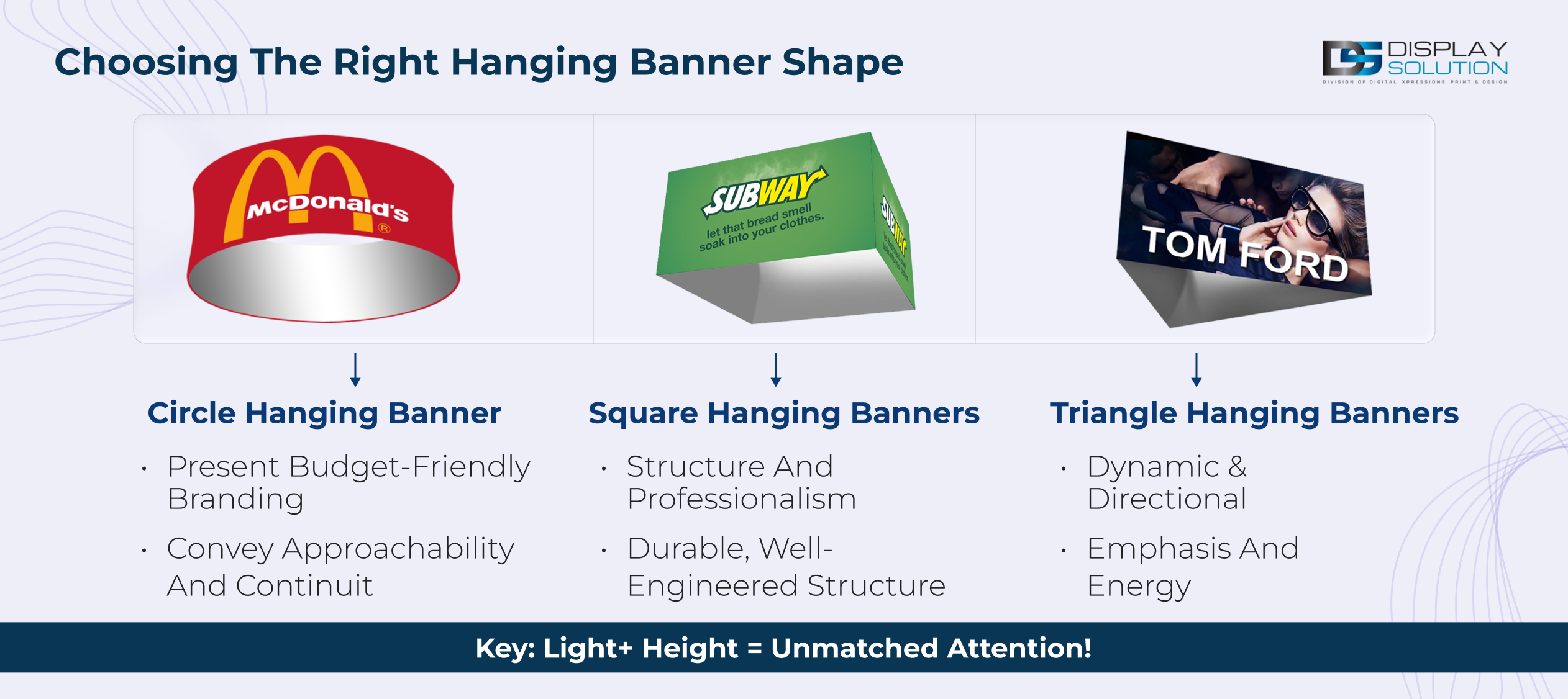
Standard Geometric Hanging Banners
Best used for: Clear branding and structured booth layouts
Geometric hanging banners create visual balance and are ideal for exhibitors who prioritize clarity, consistency, and brand recognition.
- Circle hanging banners convey approachability and continuity.
- Square hanging banners reinforce structure and professionalism.
- Triangle hanging banners introduce directional emphasis and visual energy.
Tapered Hanging Banners (Tapered Circle, Square, Triangle)
Best used for: Premium positioning and strong vertical emphasis
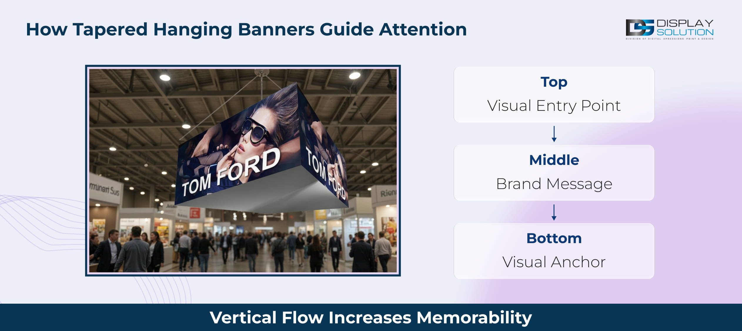
Tapered hanging banners create visual depth by narrowing toward one end, naturally drawing attention upward. This design increases perceived scale and helps signage stand out in dense overhead display environments.
Experiential design insights referenced by Exhibitor Magazine show that dimensional signage improves brand recall in multi-layered exhibition spaces.
Curved Hanging Banners
Best used for: Modern booth designs and open floor plans
Curved hanging banners soften rigid booth lines and work especially well in island booths or open layouts. Their smooth form keeps the signage visually appealing from multiple viewing angles.
Pinwheel Shape Hanging Banners
Best used for: Attention-driven activations and high-energy brands
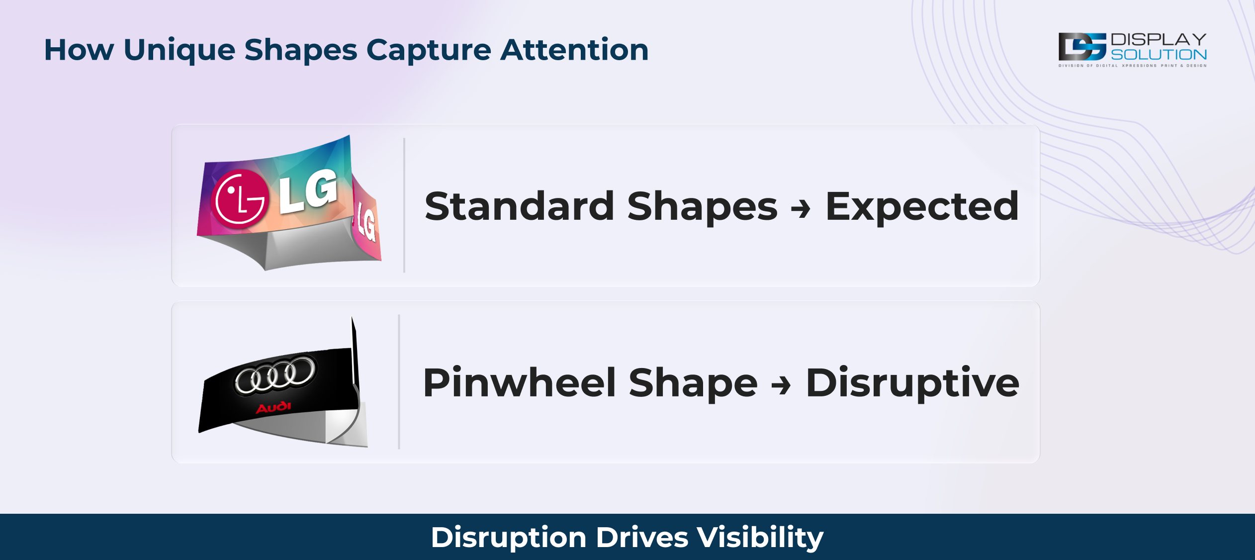
Pinwheel-shaped hanging banners use rotational symmetry to break visual patterns on the show floor. These designs work best when used selectively to highlight key areas or featured campaigns.
Insights from Event Industry News show that unconventional shapes increase visibility when they are not overused.
Football Shape Hanging Banners
Best used for: Sports, sponsorships, and themed exhibitions
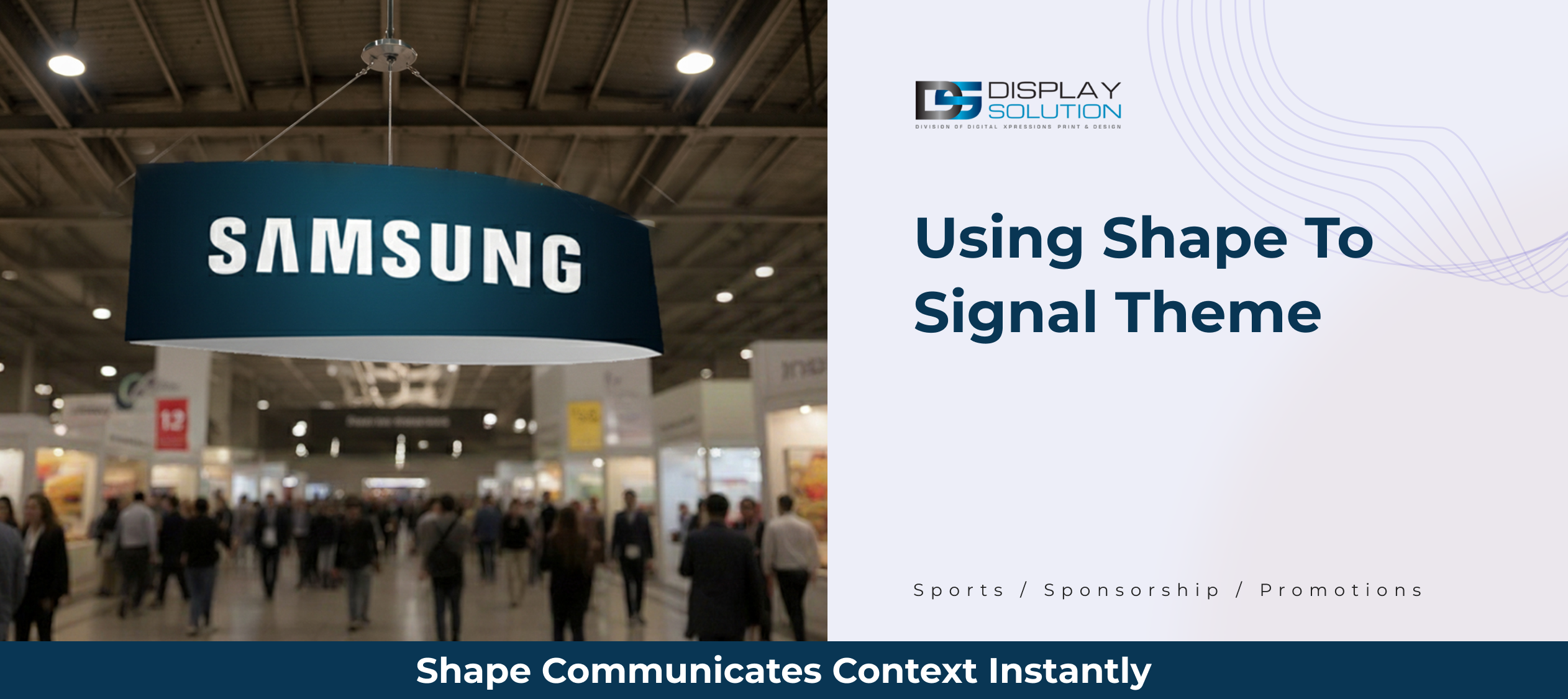
Football-shaped hanging banners provide instant contextual recognition. Their distinct silhouette allows attendees to understand the booth theme immediately, without relying on copy or additional explanation.
Spinning Motor (Motion Enhancement for Hanging Signs)
Best used for: Increasing dwell time and visual recall
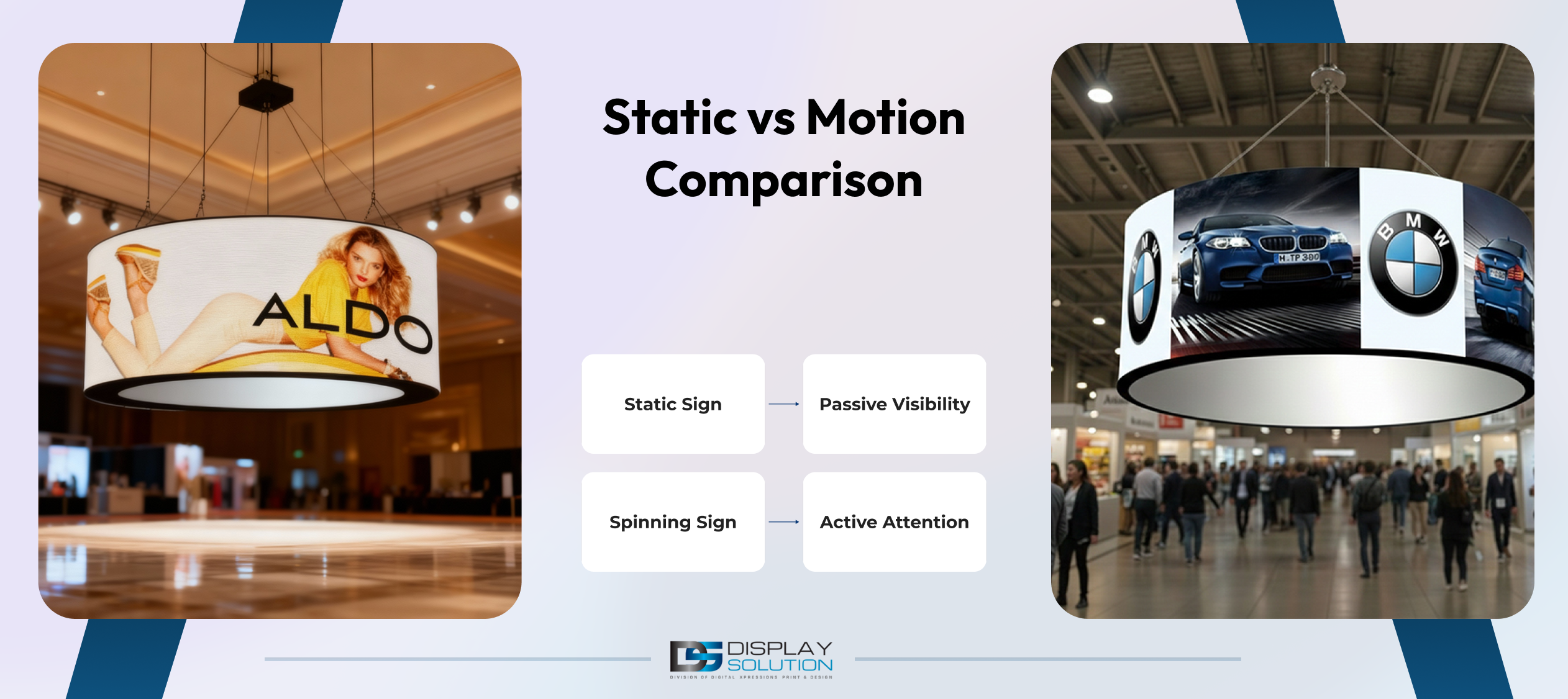
A spinning motor adds controlled motion to hanging signage, attracting attention through movement rather than extra text. Motion should remain subtle to avoid distraction.
Event technology insights from Bizzabo show that motion-enabled signage increases visual engagement when used intentionally.
Supporting Signage (Secondary Role Only)
While hanging signage handles long-distance visibility, supporting elements such as tabletop or counter signs and backwall graphics play a secondary role:
- Backwall graphics reinforce the core message introduced by the hanging sign
- Counter signs provide calls to action, product details, or next-step instructions at close range
High-Impact Trade Show Booth Sign Ideas That Actually Work
Effective trade show booth signage is not about saying more, but about saying the right thing in the right format at the right distance. Successful exhibitors use layered communication, where overhead signs capture attention, mid-level graphics establish relevance, and close-range signage drives action.
The focus here is on sign ideas that work best with hanging signage, supported only where needed by backwall and counter signs, such as information booth signs that guide engaged visitors efficiently.
1. Lead With a Single, Outcome-Focused Headline
Best suited for: LED hanging signs, square hanging banners
The strongest booth signs communicate one clear outcome. They avoid feature lists and brand stories, focusing instead on a single promise that tells attendees why stopping is worth their time.
Outcome-driven headlines reduce cognitive effort. Attendees can instantly decide if the booth is relevant without reading further.
Effective headline principles include:
- Focus on visibility instead of product specifications
- Address a problem exhibitors recognize immediately
- Avoid internal jargon or complex marketing language
Example headline styles for hanging signs:
- High-Visibility Hanging Signs for Trade Shows
- Custom Hanging Displays That Stop Traffic
- Overhead Branding Designed to Be Seen
This approach works especially well for LED hanging signs, where illumination improves legibility across long distances.
2. Let Shape Reinforce the Message (Not Compete With It)
Best suited for: Circle, square, triangle, and pinwheel hanging banners
The shape of a hanging banner communicates meaning before text is read. When the message aligns with the shape, understanding becomes intuitive.
- Circle hanging banners support inclusive and approachable messaging
- Square hanging banners convey structure, reliability, and professionalism
- Triangle hanging banners introduce direction and momentum
- Pinwheel shape banners signal energy, movement, and visual disruption
Instead of forcing the same headline across all formats, adapt the tone to the geometry. This makes signage feel intentional rather than templated.
3. Use Vertical Space Strategically With Tapered Designs
Best suited for: Tapered circle, square, and triangle hanging banners
Tapered hanging banners naturally guide the eye upward, making them ideal for dense overhead environments. Their dimensional form helps them stand out and appear more premium.
Best practices for tapered designs include:
- Keep copy short and vertically centered
- Use strong contrast between brand elements
- Avoid clutter that disrupts vertical flow
Tapered banners work best when paired with simple backwall graphics that repeat the core message at eye level.
4. Introduce Motion Only Where It Adds Emphasis
Best suited for: Spinning motor with any hanging banner
Motion attracts attention, but it should never replace clarity. Slow, controlled rotation works best when highlighting a single message or brand element.
Use motion when:
- The exhibition floor is visually crowded
- Multiple hanging signs compete in the same space
- You want to increase dwell time without adding text
Avoid motion on signs with dense messaging. Movement increases confusion if the message is not instantly clear.
5. Use Themed Shapes to Communicate Context Instantly
Best suited for: Football shape hanging banners
Themed shapes reduce the need for explanation. A football-shaped hanging banner instantly signals sports, sponsorships, or promotional activations without relying on written copy.
This approach is especially effective for:
- Sports-related exhibitions
- Event sponsorship zones
- Seasonal or campaign-specific activations
The more the shape communicates, the less text is required. This keeps overhead signage bold, clean, and readable from a distance.
6. Support Hanging Signs With Close-Range Conversion Messaging
Best suited for: Counter or tabletop signs (secondary role)
Hanging signage should focus on visibility and positioning, not calls to action. CTAs work best where conversations happen, such as counters, demo stations, or interaction points.
Effective CTA examples for supporting signs include:
- Scan to view sizes
- Ask about LED options
- See hanging banner shapes
This clear separation keeps overhead signage simple while still supporting lead generation and engagement.
Hanging Sign Ideas Matched to Strategic Use Cases
| Hanging Sign Type | Best Use Case | Primary Message Role |
|---|---|---|
| LED hanging sign | Large halls and low-light environments | Visibility and brand recognition |
| Circle hanging banner | Approachable branding | Brand presence |
| Square hanging banner | Corporate or B2B booths | Stability and trust |
| Triangle hanging banner | Directional layouts | Energy and movement |
| Tapered hanging banner | Premium positioning | Visual depth |
| Curved hanging banner | Island or open booths | Modern aesthetics |
| Pinwheel shape banner | High-energy activations | Attention capture |
| Football shape banner | Sports and sponsorships | Instant context |
| Spinning motor | Competitive environments | Motion-driven emphasis |
How to Design Trade Show Booth Signage That Attracts Visitors
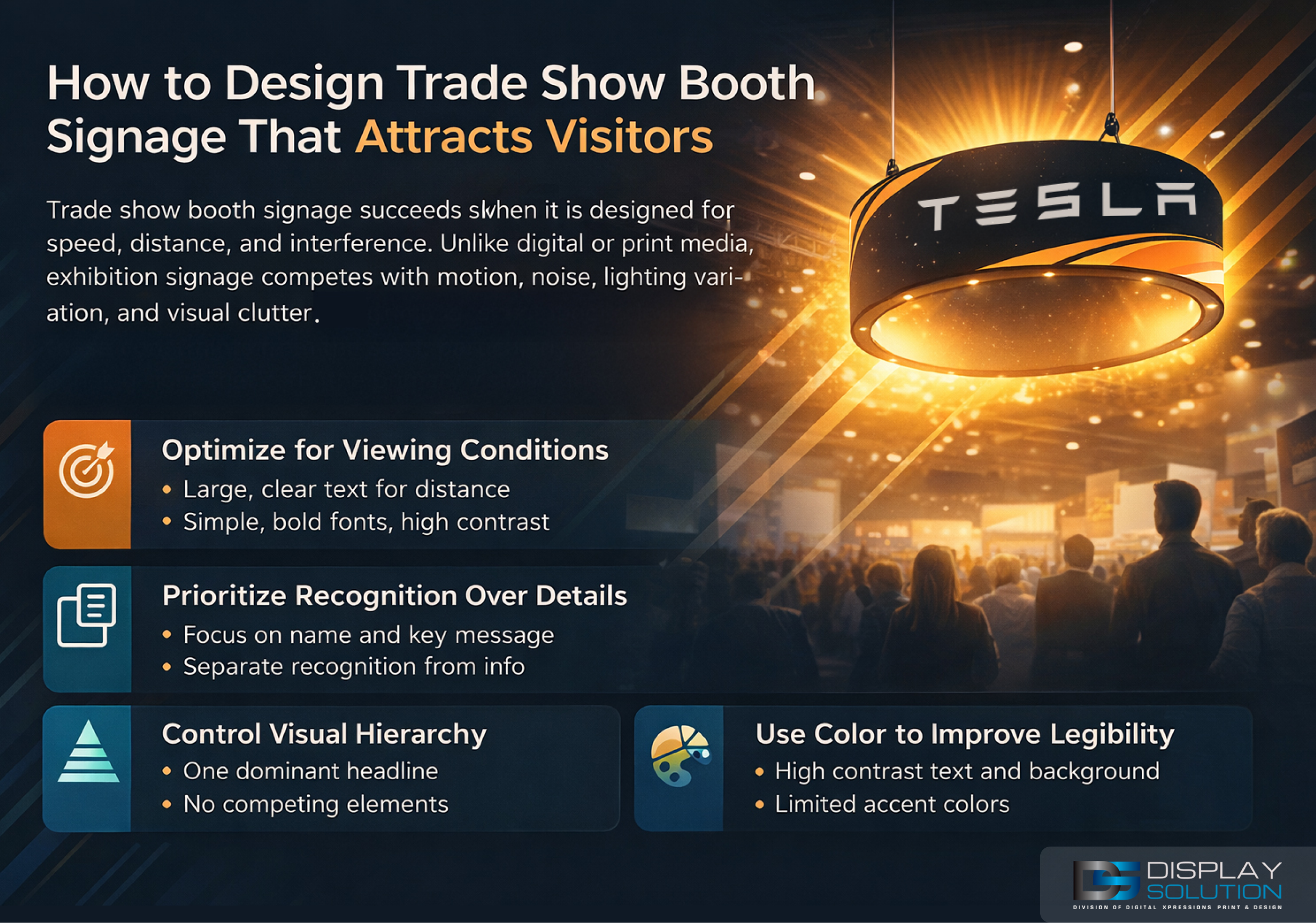
Trade show booth signage succeeds when it is designed for speed, distance, and interference. Unlike digital or print media, exhibition signage competes with motion, noise, lighting variation, and visual clutter. Design decisions must account for these constraints from the start, especially for overhead hanging signs that carry primary visibility.
This section outlines the non-negotiable design principles that determine whether signage performs or disappears.
1. Design for Viewing Conditions, Not Brand Guidelines
Most signage failures happen when brand rules override real viewing conditions. Fonts that work on websites or brochures often fail when suspended 20 feet above the floor.
For hanging signage:
- Headline letter height must scale to viewing distance, not brand preference
- Condensed or decorative fonts reduce legibility when viewed at an angle
- Stroke thickness matters more than font style at distance
LED hanging signs help maintain contrast, but illumination cannot fix poor typography.
Rule: If the headline cannot be read clearly in under two seconds from the aisle, the design fails.
2. Separate Recognition From Explanation
High-performing booths treat signage as a layered system, not a single surface.
- Hanging signs: recognition
- Backwall graphics: confirmation
- Counter signs: action
Trying to explain products or features on hanging banners creates clutter and weakens recognition. This is especially damaging for tapered, curved, or rotating signs.
Infographic: Signage Role by Distance
- Hanging sign → Brand and category
- Backwall → Value and differentiation
- Counter sign → CTA and interaction
- Each sign has one job
3. Control Visual Hierarchy With Discipline
Every sign must have one dominant element. When multiple elements compete, none win.
Hierarchy rules that work:
- One headline only
- Logo placed above or below the headline, never competing
- Supporting visuals must not intersect with text
- No secondary messages on hanging signs
Curved and tapered banners amplify hierarchy mistakes because distortion exaggerates imbalance.
Rule: If viewers do not know where to look first, the hierarchy has failed.
4. Use Color to Separate Elements, Not Decorate Space
Color on trade show signage is functional, not decorative. Its role is to:
- Separate foreground from background
- Maintain legibility under artificial lighting
- Preserve contrast across angles and motion
Effective color usage:
- One dominant background color
- One high-contrast text color
- One accent color used sparingly
Gradients, textures, and low-contrast palettes reduce readability when signage is suspended overhead.
5. Account for Motion Before Adding Motion
If a spinning motor is used, the design must anticipate rotation. Text, logos, and spacing must remain readable from multiple angles.
Design adjustments for rotating signs:
- Center-align primary text
- Avoid edge-aligned copy
- Increase spacing between elements
- Reduce text more than static designs
Motion should improve noticeability, not increase cognitive effort.
6. Keep Supporting Signs Function-Specific
Backwall and counter signage should reinforce, not reposition.
- Backwalls repeat the message introduced overhead
- Counter signs answer “what next?”
Any deviation breaks continuity and weakens recall.
Trade Show Booth Signage Checklist (Before You Print)
Note: This section is operational. Use it after design approval and before print or fabrication.
1. Message and Content Validation
- Each sign has one clearly defined role
- Hanging signs communicate brand and category only
- No product descriptions on overhead signage
- One headline per hanging sign
- Message is clear without explanation
Checkpoint: If the message cannot be summarized in one sentence, it does not belong on a hanging sign.
2. Readability and Distance Check
- Headline readable from maximum viewing distance
- Strong contrast between text and background
- No thin, decorative, or outlined fonts
- Logo does not overpower the headline
Checkpoint: Test the design at scale or simulate distance on-screen.
3. Shape and Layout Compatibility
- Text and logos stay within safe zones
- Curved, tapered, or rotating designs account for distortion
- Layout remains balanced from multiple angles
Checkpoint: Confirm readability from at least three viewing angles.
4. Motion and Hardware Readiness
- Rotation speed is slow and controlled
- Text is center-aligned and evenly spaced
- No critical information near edges
- Power requirements confirmed with organizers
Checkpoint: If motion reduces clarity, remove motion.
5. Color and Print Accuracy
- Colors tested under artificial lighting
- Dark-on-dark and light-on-light avoided
- Brand colors adapted for visibility
- No gradients or textures at height
Checkpoint: Test colors against a simulated show-floor background.
6. Supporting Sign Alignment
- Backwall graphics repeat overhead messaging
- Counter signs introduce CTAs only
- No conflicting headlines across booth elements
Checkpoint: If a supporting sign introduces a new idea, revise or remove it.
Pre-Print Validation by Sign Type
| Sign Element | Must Confirm Before Print |
|---|---|
| LED hanging sign | Even illumination and clear readability at distance |
| Geometric hanging banner | Shape supports message tone |
| Tapered hanging banner | Vertical alignment and spacing preserved |
| Curved hanging banner | No text distortion at edges |
| Pinwheel / football shape banner | Shape clarity not compromised by copy |
| Spinning motor | Rotation speed and power approved |
| Backwall graphics | Message matches hanging sign |
| Counter signs | CTA is clear and action-focused |
Final Pre-Production Check (One-Minute Test)
Before approving final files, confirm yes to all three questions:
- Can attendees understand who you are in under three seconds?
- Is the message readable without stopping?
- Does every sign perform one clear role?
If any answer is no, revise before printing.
Contact a Trusted Company
When investing in trade show signage, credibility, trust, and service matter. Display Solution delivers high-quality hanging signs designed to perform in real exhibition environments. From design to production, every solution is built to support visibility, consistency, and measurable results.
No matter the hanging sign type you require, placing your order with an experienced provider ensures your booth is positioned for success.
FAQs About Trade Show Booth Signage
What should a trade show booth sign say?
A trade show booth sign should clearly state who the brand is and what category it belongs to. Overhead signage works best when it communicates relevance and recognition, not detailed product information.
Effective hanging sign content includes:
- Brand name
- Product or service category
- One short positioning phrase (optional)
Features, pricing, and offers should appear on backwall or counter signage where attendees are already engaged.
How big should trade show booth signs be?
Sign size should be based on viewing distance, not booth size. Hanging signs must be legible from the farthest aisle where attendees notice the booth.
- Use large headline text for overhead signage
- Keep logos secondary to message clarity
- Allow extra spacing for tapered or curved banners
Always confirm size and rigging requirements with event organizers.
Are LED hanging signs better than non-lit banners?
LED hanging signs perform better in large halls, uneven lighting, and visually competitive environments.
- Dim or inconsistent lighting
- Large exhibition floors
- High visual competition
Illumination improves visibility but does not replace strong typography or clear messaging.
Is it better to use motion on hanging signs?
Motion works when used selectively. Slow, controlled rotation increases attention without adding confusion.
Motion works best when:
- The message is short and clear
- The layout is centered and balanced
- Rotation speed remains subtle
Text-heavy designs perform better as static signage.
How many signs should a trade show booth have?
There is no fixed number. High-performing booths focus on role clarity, not quantity.
- One hanging sign for visibility
- One backwall graphic for confirmation
- One or two counter signs for action
Adding more signs without defined roles often reduces clarity and engagement.
Final Thoughts
Trade show booth signage is a strategic tool that drives visibility, comprehension, and engagement. Hanging signs establish presence and guide attention long before conversations begin, while backwall and counter signs reinforce messaging and prompt action.
Exhibitors who treat signage as a coordinated system, rather than isolated graphics, consistently achieve stronger booth performance. When message clarity, shape selection, motion control, and layout discipline align, signage works continuously throughout the event.
In competitive exhibition environments, the difference between being noticed and being overlooked often comes down to signage decisions made before the event opens. Designing with intent and validating before production ensures your booth communicates clearly and confidently from every angle.


